xPeptides Brand Guide
Logo, colours, typography and the vial-label system — with ready-to-use and print files. Keep everything consistent so the brand reads as one lab.
Logo
Primary lockup = X mark + “xPeptides”. Use the dark version on dark backgrounds, the light version on light. Keep clear space around it equal to the height of the X. Minimum width 90 px on screen.
Colours
Typography
Headlines, product names, labels.
UI, paragraphs, buttons.
Prices, CAS, purity, batch, COA.
All three are free Google Fonts (Archivo, Inter, IBM Plex Mono).
Vial label system
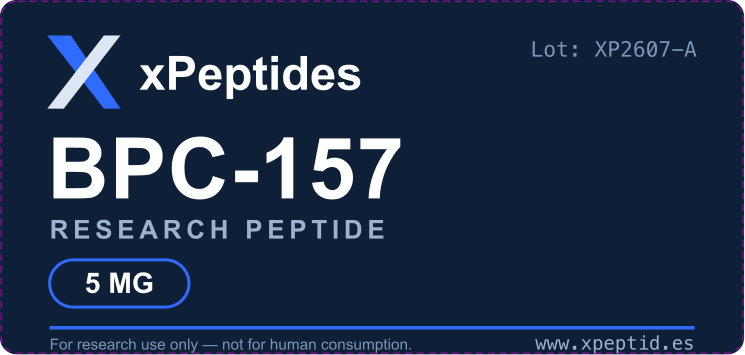
Every product uses the same navy label: logo top-left, Lot number top-right, large product name, “RESEARCH PEPTIDE”, an outlined mg badge, a blue rule, and the RUO line + www.xpeptid.es at the bottom. Size 63 × 30 mm (10 ml vial); add 3 mm bleed for print.
Print note: files are RGB with a magenta dieline (cut edge). Before final print, convert to CMYK, outline the fonts (Archivo / Inter / IBM Plex Mono) and hide the dieline layer.
Do & Don’t
- Keep clear space = height of the X.
- Blue as the only accent; navy/ink + white for the rest.
- Uppercase Archivo for names & headlines.
- Mono for any number (purity, CAS, price, lot).
- Don’t recolour the logo or add effects.
- Don’t use gradients or glassmorphism.
- Don’t stretch or rotate the mark.
- Don’t put the light logo on a busy photo.